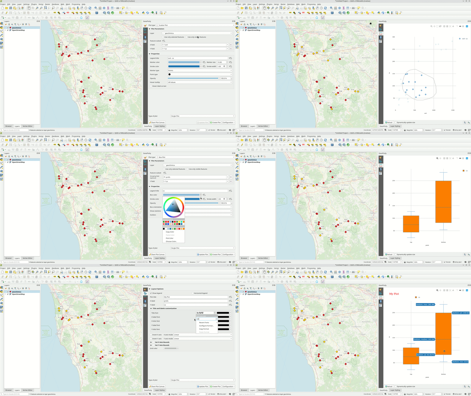
The DataPlotly plugin
The plots are completely interactive and interact with map features: when clicking or selecting a plot element the corresponding map feature will be highlighted.

DataPlotly allows the creation of many different plot types: each plot type has many additional customization that enhance the plot in many different ways.
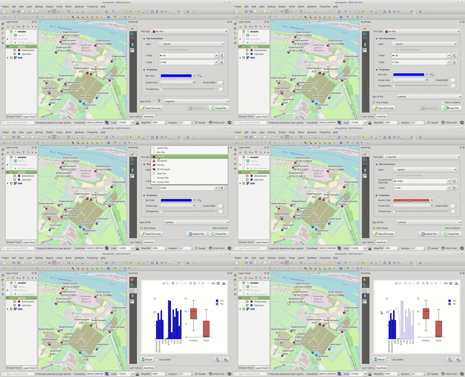
Besides the possibility of a single plot, DataPlotly allows to overlap the plots (even of different type) or the user can separate the plots in a plot grid.
DataPlotly uses the JavaScript library Plotly constantly developed and updated. Thanks to different API, Plotly can be used also with different programming languages (Python, R, NodeJS, etc.).
Each plot has its raw html code that can be embedded anywhere.
Furthermore plots can be saved as static (png) images of as html files: the latter keep the plot interactivity.
Multilanguage Support
DataPlotly is translatable in different languages. Both GUI and manual are hosted on Transifex where you can ask for your language and translate DataPlotly.
Currently the plugin is avilable in:
- English
- Italian
- Dutch
- Swedish
- French
DataPlotly Enthusiast
Many users and QGIS developers are happy of DataPlotly. At Oct 22, 2018 the plugin counts around 2000 downloads and has many citations on websites and blogs:
- https://anitagraser.com/2017/12/06/data-exploration-with-data-plotly-for-qgis3/
- http://millermountain.com/geospatialblog/2017/12/18/qgis-data-plotly/
- https://geosupportsystem.wordpress.com/2017/12/13/diagram-i-qgis-3/
- https://www.youtube.com/watch?v=SxtVAtZ4bjA&feature=youtu.be
DataPlotly Support
Many other functionalities can be added in DataPlotly. If you're interested in supporting the plugin, you can request new features to be added.
Tips And Tricks
The plugin supports all the QGIS functions (expressions, dialog windows, color picker, etc.). Here's a collection of tricks to use in DataPlotly.
Create many plots in different
Besides overlapping plots on the same plot canvas, DataPlotly allows to separate plots in grids. This option is useful when the measurement units are very different and overlapping the plots is not a good idea.
